Accurate and consistent color rendition is key in photography and there are several factors to consider while managing it in your work. You’ll need to think about what your client wants, where the media will live, and ensure that the settings on your camera and software are in alignment. In short, understanding color space is important.
If you throw in the need to frequently calibrate your monitor, any misalignment breeds the potential for a perfect storm of frustration. Peter McKinnon recently ran into some challenges in maintaining color consistency and decided to dig a little deeper to find out why.

What is Color Space?
“The range of colors that are available to your camera.”
This is an oversimplified, yet sufficient summary and introduction to the topic. However, it is a topic that’s worth investigating if you intended to work with high-end publishing.
sRGB v Adobe RGB
“sRGB” is better suited for media that you intend to display on a screen.
“Adobe RGB” is a is better suited for media you intend to print.
[REWIND: SRGB VS. ADOBE RGB | WHICH SHOULD YOU USE?]
Color Space in your editing process
You should be syncing the color space across the different editing platforms to ensure that your images throughout the process are consistent. If you recognize that your colors look different in Photoshop after starting your editing in LIghtroom, you’ll need to check your settings. Here is how you do it.
Syncing Color space in Lightroom, Photoshop, and your camera
In Adobe Lightroom…
File > Export > File Settings

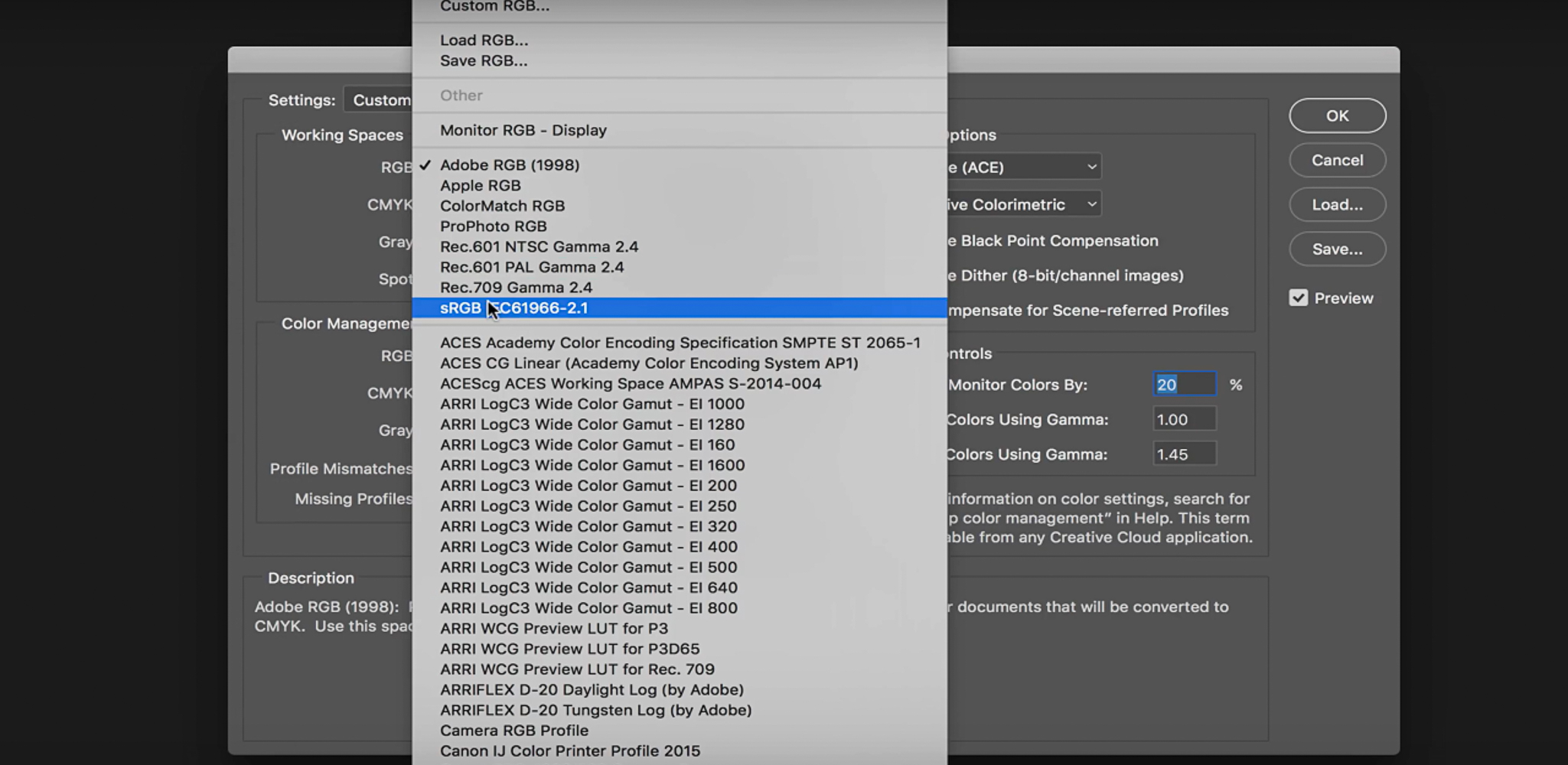
In Adobe Photoshop…
Edit > Color Settings
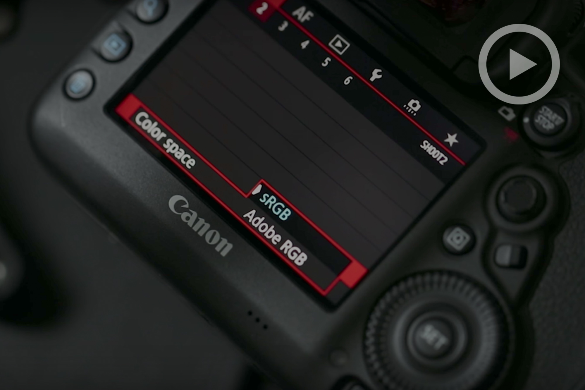
For Canon cameras, You’ll find your color space setting as the fourth option on the first menu.
More Articles on Color Space
CMYK VS. RGB AND WHY YOU SHOULD CARE
A BREAKDOWN OF COLOR SPACES | YOU REALLY SHOULD HAVE A GRASP ON THIS


Get Connected!