It’s incredible the physiological effects some new education can have on someone, and it’s always interesting to be looking at their face the moment they arrive at some ‘ah-ha’ moment. I see it all the time in photography, primarily with those who are rather green in experience, and it’s generally very gratifying. Try, if you can, to remember the first time you shot with some real fast glass, and how with nothing but a turn of an aperture ring made your subject stand out in front of a background that looked as smooth as heavy cream. The look is some strange combination of confusion, awe, “wait, what just happened?” and genuine revelation.
There are numerous times in a photographer’s life and learning curve that we experience these moments, and hopefully, they continue throughout our career and never cease. However, the more seasoned you become, the more infrequently they tend to happen, especially when it pertains to camera mechanics, and basic camera theory to put into practice. Where it seems to return is when the image returns to the lab, or into post processing. It’s such a vast area and unlike the mechanical part of image taking, this is constantly evolving, so there’s often more to learn.

The split toning panel in Lightroom, in my estimation, has got to be the most ignored panel in the Develop module, and that’s a shame because you really aren’t getting the most out of your programs (or your potential), without an understanding of how it works, and using it. You may be good at processing in Lightroom, the way a college freshman is good with a can of tuna, but when you really grasp these panels and tools, you’ll be the full-on Gordon Ramsay. Split toning then, when understood, could lead to your next ah-ha moment.
[Free Tutorial: 4 Lightroom CC Features You Should Know]
Split Toning
At its very base, split toning is a division between the lights and darks of an image and the coloring of each of these independent of the other. This does not affect brightness, or amount of shadows or whites, but simply the color. Its history dates back to film photography of long ago, and I won’t pretend as if I actually fully understand its roots, but its old association with black & white has carried over in many people’s minds and is often used today while editing b&w images.
Anyway, you can change an image by a remarkable measure by including split toning in your workflow. Do you use presets? Of course you do, and whether you use the SLRL Preset System or something like VSCO or Mastin Labs, the use of split toning will enable you to take those presets further, and to allow you to differentiate your look from that of others using those presets.


Split toning is also useful in manually adjusting white balance, which is something we’ll touch on, but in my opinion, the most important thing split toning allows you to do is change the feel of an image without necessarily affecting skin tones, and allowing you to apply color theory to some degree into each image without it being blatantly obvious.

Color theory, as daunting as the word ‘theory’ may sound, is just the understanding of how colors interact, their mixtures and their implementation. Color is all around us so often that we fail to always notice much about it, other than the fact that it’s there. But color, like photography, can be thought of as a way to communicate – a silent language, if you will, much like photography. It is the roof under which hue, value, and chroma reside, and we adjust those all day in post. I’ve stressed before the importance of color theory, and I’ll continue to do so from the crypt because it remains today the omnipresent feature of images people love, about which they can be heard saying, “I don’t know what it is about it, but it’s great.” It’s the x-factor of many a great image, and split toning will help you implement it.
How? Well let us take the obvious example of the two-toned wash of orange and blue – it’s everywhere, and the most prevalent use of complementary colors within film and photo. The two colors sit at odds on the color wheel, which means they’re complementary, meaning they go really well together, and there’s something about the combination we like. It’s why movie posters and films will use this two-tone approach all the time. Movies and photos have people in them for the majority, and since skin often has variations of orange hues, peppering in blue as a second prevailing color-motif makes sense, and this is often accomplished by splitting between shadows and highlights.


In fact, this sort of combination is so popular and using split toning to achieve it so favorable, that many of the presets we enjoy and filters we use on apps like Instagram, Facebook, and VSCO, use both the color combination and split toning to achieve it. You may not see it, but when you hit that HB1 preset or whatever, it’s happening. Some mobile apps now, like VSCO and Enlight, have the option to split tone on the fly from your phone – so if Instagramers can do it…
[Free Tutorial: Learn to Pose Couples, Brides and More]
The Panel & Sliders
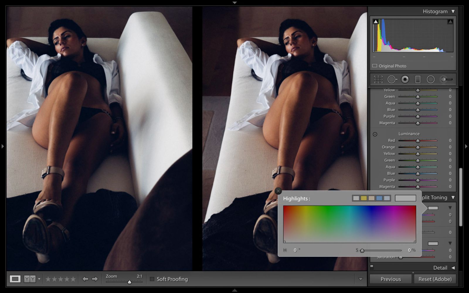
So what are you looking at when you open the Split Toning panel in Lightroom? You’ve got three sections split into ‘Highlights’, ‘Balance’, and ‘Shadows’. Within Highlights and Shadows, you will see a small box and two sliders for hue and saturation.

Using the Hue slider in either shadows or highlights, you can choose the perfect hue you’re looking for then use the Saturation slider to apply it at the desired strength. However, the sliders are small, and for hue, this is of a particular nuisance because it’s difficult to see which color you’re on since LR doesn’t natively show you in the preview. However, if you hold down ‘alt’ while moving the Hue slider, you’ll be able to see that color previewed at 100% saturation, making it simple to choose. Once you let go of ‘alt’, you won’t see it until you apply saturation.

Now, if that’s not your particular brand of vodka, or you’ve got fingers of sausage and fists of ham where moving itty sliders proves problematic, the little box will come in handy. Simply click that and you’ll be presented with a larger color palette resembling Photoshop’s Color Picker tool (see image above). In this case, you simply move the eyedropper over the particular color you want, click it, and that’s it. As you move up and down within that color chart, you’ll automatically adjust saturation, though there is an ability to control that slider, too.
The Balance slider is simply there for you to fine tune the proportion of your split toning in shadows and highlights. The further right you travel with it the more pronounced the highlight toning will be compared to the shadow toning, and the more to the left, the more prominent the shadows will be, naturally.


That’s really all there is to it, but the applications can be great. I would generally caution that it’s very easy to overdo split toning and sometimes you’re so deep in an edit you don’t realize how far from reality you’ve come, so frequently hit the backslash to see your before/after. This shouldn’t turn you away from using the tool, but understand it’s something that is best handled with a delicate touch, where subtlety (I tend to have my saturation hovering anywhere from 5% to 12%) is the aim and name of the game. If you use it as such, you’ll find applications for it in landscapes, portraits, and just about everywhere. It’s also wonderful for keeping a consistent look in a set of images even if shot in varying lighting or locations, as I demonstrate above.
[REWIND: CULLING IS CRITICAL & LIGHTROOM IS THE TOOL TO DO IT WITH (IF YOU KNOW HOW)]
If you want to have your eyes opened as to what Lightroom can really do, I always recommend the Lightroom Workflow Collection as the surest way to go from being good to absolutely astonishing in LR. Check it out here.