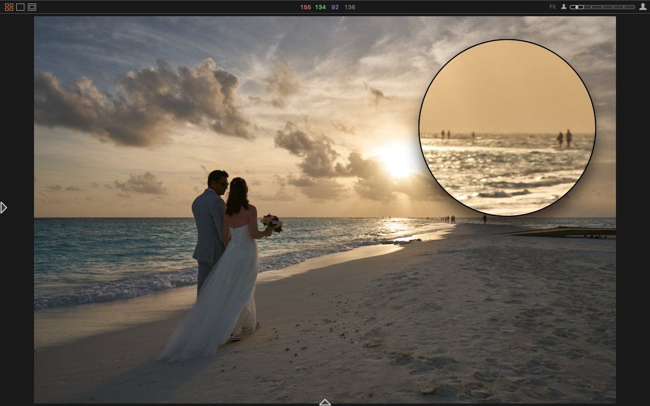
We can argue all day about whether Lightroom or Capture One is the “better” program. In reality, as with most gear/software debates, it will always come down to a subjective judgement – which is better for you, your preferences, and your workflow. But I don’t know you, so this will be about my workflow, and why I still use both programs, in tandem, on almost every project.
Each of these powerful pieces of software have their strengths and weaknesses, their time-savers and annoyances, and this post will serve as both an open letter to Adobe and Phase, and a guide to some tips and tricks I’ve found in each of them. From my subjective perspective.
Things I Love About Capture One
I lean heavily on Capture One for culling and actually processing my images. It’s difficult to quantify, and has been documented before, but I just like the way that the C1 engine makes my photos look from the moment they’re imported. It’s not a huge difference from the look I get from Lightroom, but if I have a choice between the two, I’ll import my raw files via Capture One every time. And I do have that choice.

For culling images, there is simply no contest. Capture One has a focus overlay tool, with which you can push one button, and it will quickly display a semi-opaque mask in the color of your choice, over the areas of your image that are in sharp focus. This can be turned on in browser mode, so you can see, at a glance, which photos are correctly focused, and which are garbage.
In my portrait work, this is a massive time-saver. On top of that, if there is any question as to whether the focus is accurate, the loupe tool comes into play. Again, from the browser mode, with multiple photos displayed at once, you can long-click on any portion of a photo to bring up a magnified view of that area. Game Changer.
Another huge advantage of Capture One is the High Dynamic Range tool. It’s just two sliders, Highlights and Shadows, but it is remarkably powerful. Being able to quickly and easily recover the massive amount of dynamic range hidden in the raw files from my A7Rii is mind-blowing.
You can get a somewhat similar effect in Lightroom using the Blacks and Whites or Shadows & Highlights sliders, but those tend to have a more drastic effect on the rest of the image, in my opinion.


Also, the color tab is phenomenal. The Color Editor, used in its most basic mode, is very similar to Lightroom’s HSL panel, but in C1 there’s so much more.
Advanced mode offers the ability to make much more specific color selections, defining the hue and saturation limits, as well as the smoothness of the transition, and allows users to export that selection as a mask for local adjustments. On top of that is the Skin Tone Editor, wherein you can precisely define the skin tone of your subject, and increase its uniformity in hue, saturation, and lightness, immediately improving your subject’s apparent complexion.

Finally, Capture One handles previews far better than Lightroom. When an image is imported, a preview is automatically, and quickly built and saved inside the catalog. This does increase the file size of your Capture One catalogs, but also seems to increase speed and efficiency when editing.
Working when not connected to your original files, which can be safely stored on an external drive, is seamless. Yes, Lightroom can accomplish this with smart previews, but it seems to take forever to build them, and generally feels less streamlined.
There are other clever, useful tools and abilities cooked into Capture One, including an improved Clarity tool, the Three-Way color balance tool, and the Luma (some buy COP just for this) option in the curves tool, but those don’t have nearly the impact on my work as those listed above. For another perspective on Capture One’s greatest hits, check out a few posts you may have missed:
PHASE ONE CAPTURE ONE PRO TIPS | THE AWESOME LOCAL ADJUSTMENTS PANEL
PHASE ONE RELEASES CAPTURE ONE PRO 10 | OUR HANDS ON FIRST LOOK REVIEW
IS IT TIME TO SWITCH FROM LIGHTROOM TO CAPTURE ONE PRO? HERE’S WHY IT MIGHT BE
Why I still Need Lightroom
I used Lightroom for years before I ever even tested the waters with Capture One. Lightroom is much more intuitive than C1, with a much easier learning curve, but as I’ve played with each program, Capture One has become my favorite in many ways. However, there are a few key areas where Lightroom still holds a significant advantage.
One of those is the availability of plug-ins. There are a variety of them available, and only a few that I use regularly, but when I do they offer huge time savings. One is the Format uploader. I have my website hosted with Format, (which I highly recommend) and since they’ve added proofing galleries to their offerings, their Lightroom plug-in has become a life-saver. I log into my account inside of Lightroom, create a new page the same way I would add a collection inside my catalog, and then just drag and drop. The images are automatically resized, exported, uploaded and organized for me, and I can easily add or remove a watermark if I so choose.
The other plug-in that I use and recommend is the Flickr uploader. I don’t use Flickr very much personally, but I work for a few clients who insist that selected shots be captioned, titled, tagged and uploaded to Flickr ASAP. Again, with a process similar to the one I use with Format, Lightroom makes it all incredibly easy.
The Final spot where Lightroom picks up Capture One’s slack is in .psd integration. C1 can export edited images as .psd’s, but cannot read them. Lightroom, being an Adobe product, can read them, and then easily export them, even a folder full of them, in any format or size you might like, using their export presets. They’re treated exactly like any other JPEG, TIFF or raw file in your library.
While less of a departure from Capture One’s capabilities, I prefer Lightroom’s export presets to C1’s process recipes. Lightroom includes the very useful “choose folder later” and “same folder as original photo” options, and once a preset is saved, it’s locked in. In Capture One, if you pick a previously created recipe, and then change a few parameters for a particular export, you’ll have to change them back the next time you want to use that recipe. Not horrible, but still annoying.
Other noteworthy advantages within Lightroom include the availability of VSCO and SLR Lounge presets, the Dehaze tool, the Vibrance slider, Develop Snapshots, the quick before/after preview button, and the Lightroom Mobile app. Essentially, Lightroom is still excellent for anything where ease of use is the top priority. For further reading, tips and tricks, etc., see:
PRESETS & THIS TOOL ARE WHAT ALLOW ME TO RETOUCH WITH EASE & ACCURACY IN LIGHTROOM
LIGHTROOM’S DARK KNIGHT |THE ALT/OPT KEY TRANSFORMS LIGHTROOM IN WAYS YOU LIKELY DON’T KNOW [PART 1]
HOW TO SET-UP YOUR WACOM INTUOS PEN TABLET FOR LIGHTROOM
In Conclusion
So, (remembering that this post is all about me) my workflow generally begins in Capture One, where culling is lightyears faster than Lightroom. If I need to upload proofs before editing begins, I’ll move over to Lightroom to use its plug-ins, and then go back to C1 to edit my tone curve, colors, clarity, etc. If Photoshop is required, I can export as a .psd, perform those pixel-level adjustments, and then re-open the .psd in Lightroom to be exported. Needless to say, there is room for improvement, not on my end of course, but on the part of Adobe and Phase One’s developers.
I love Capture One. I like Lightroom. Capture One is my preferred program simply because I like the tools it offers to make my images look their best. While it is certainly missing some convenience features, which are abundant in Lightroom, it still feels like the more complete, professional tool. I wish that the good folks at Capture One would steal a few pages from Adobe’s book, make certain aspects more intuitive, and add a few new bits of functionality, but for the time being, I’m satisfied with the trade-offs.


