Pratik Naik has been working in the photography industry as a high-end retoucher and educator for more than 10 years, with his work published in the likes of ELLE, Harper’s Bazaar, GQ and Marie Claire.
This experience, naturally, translated well to education, and Pratik has pursued that facet via tutorials with RGG EDU & Sue Bryce among others, workshops, and through various online communities.
While most of the steps of raw adjustment and retouching are technical skills that can quickly be applied by most photographers and aspiring retouchers, one thing that many struggle with is “seeing” colour, understanding harmony, and using this information to grade their images. It is with that in mind that Infinite Color was designed to simplify the process of finding a colour scheme and applying it to your pictures.
Over the last few weeks, I have been test-driving the Infinite Color Panel and I’m sharing my experience, impressions, and how I use it.
[RELATED: Photoshop Tip | Split Your Screen For One Image To Maximize Efficiency]
What is Infinite Color?
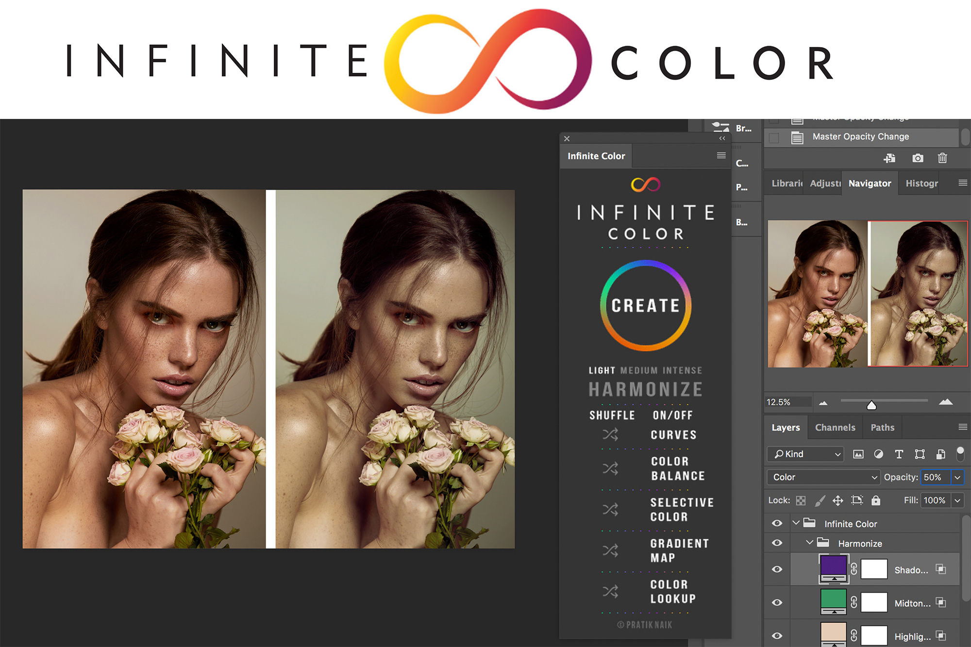
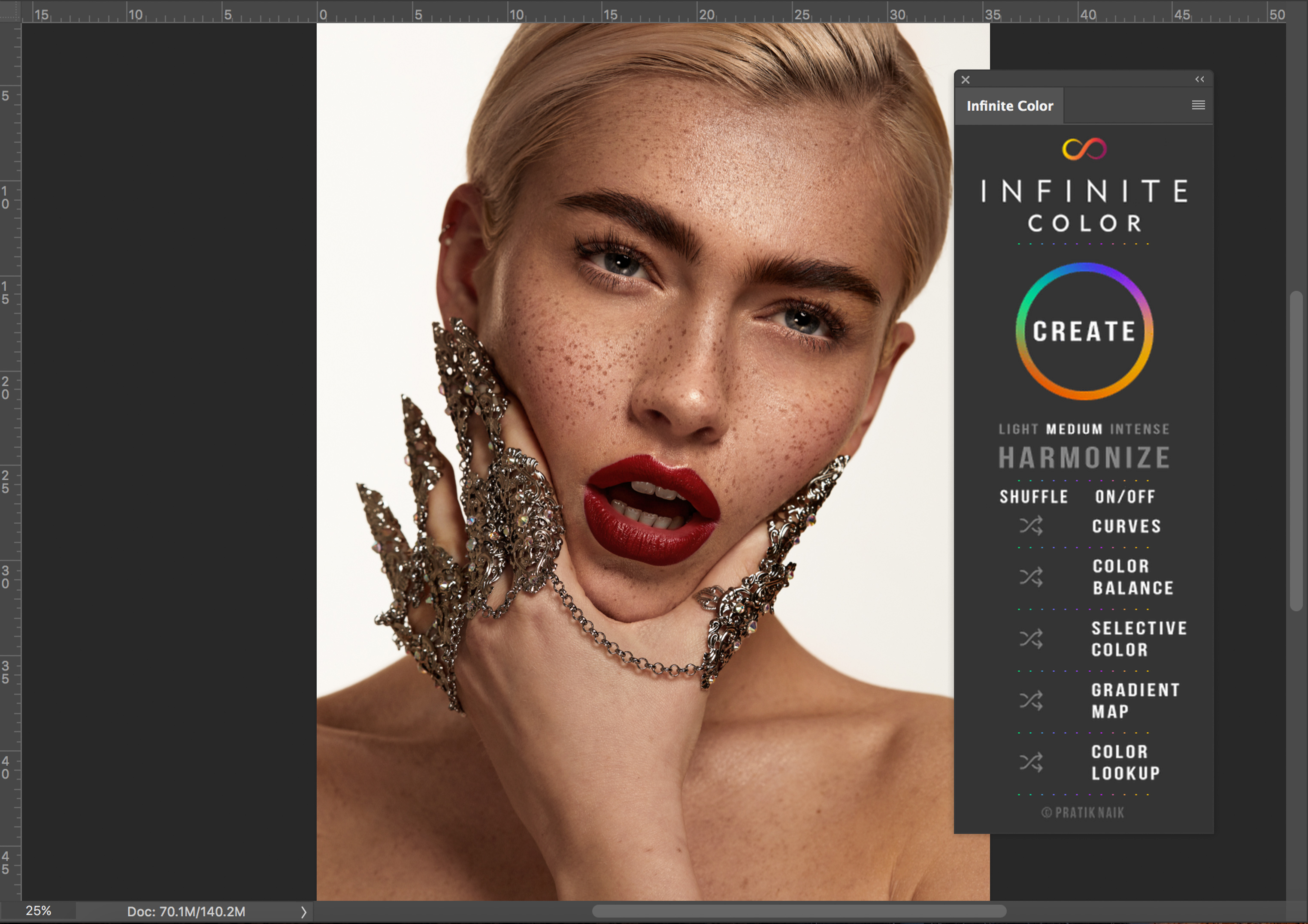
Infinite Color is a colour-toning tool operated via a panel extension in Photoshop. By randomising a set of adjustment layers it provides the user with a suggestion of which colour direction to take their images, while giving them control over the intensity of each layer.
If you, like me, are one of those people that can look at a beautifully toned image yet have no idea why we like it or how to apply a similar grade to our own work, this tool could help overcome those hurdles, spark creativity, and increase the quality and uniformity of your image sets.
At its core, Infinite Colour was designed to guide you to see the colour possibilities in your pictures, help you decide what you want to achieve, and apply it to your work in the fastest possible time.
Random, Yet Customisable.
After installing the panel it is easy to get stuck in immediately.
The sleek, intuitive design consists of a big, colourful “Create” button; 5 separate adjustment layer choices for Curves, Colour Balance, Selective Colour, Gradient Map and Colour Lookup; one Harmonize option, and your choice of Light, Medium or Intense application.
Upon pushing the Create button the app then generates a randomised result for each one of the adjustment layers with the option to enable/disable the layers you choose, as well as being able to shuffle any layers you’re not happy with while the ones you like remain.
*The opacity of each adjustment layer can be tweaked individually until you’re completely happy with the outcome.

The colour schemes you create will be unique to your picture and selections, with an infinite number of possibilities.
While I tend to stick to subtle toning choices for most of my beauty images, as you can see in the example above, the panel has tempted me to try and push my own boundaries a little further to create some stunning, unexpected results.

And it continues from there.
Once I’m happy with a colour combination I simply rename the Infinite Colour layer to any title I chose which now prompts the panel to create a new Infinite layer on top of the first one.
This way a user can stack different colour creations and create the most unique combinations for my work.

Smart Settings
Once I am happy with my creation, I have the option to save the settings I achieved into Creative Cloud’s Libraries and apply them to other images of the same set, something that is very important if a set is, for example, to be published.
This allows me to tie all the images of the same series together with one uniform colour choice.

I found myself clicking the Create button over and over again, excited by the next creation it would cook up for me and sometimes the feeling of “Wait, I did actually like the one before?” would come over me. Clever scripting, however, allows you to click the Undo button and take your image back to the whole previous look, rather than just undoing the last “step” of the action.
Another clever feature of the panel is the fact that once you decide which opacity works best for you, all actions you create from this point forward will automatically be presented to you in the same opacity as a starting point for you to play with.
Harmonize
While the Create button gives you the freedom of exploring a large palette of colours and to discover a whole array of subtle, bold, bright or muted tones, the Harmonize option works with the colours already present in your image, analyses the existing tones in your shadows, highlights and mid-tones and presents you with a colour grade it deems most pleasing.
You then have the option to tweak each region to your personal taste.

For me, the Harmonize tool alone makes this panel priceless. Every single image I tried this on opened my eyes to colour harmony and brought me a little closer to understanding colour grading and producing something pleasing to me and viewers of my imagery.
In my experience, I have achieved numerous beautiful results without spending hours on tweaking and twisting layers and trying combinations that might or might not work. As such, Infinite Color allows for the pushing of creative boundaries and rewards a user with professional-grade results while saving time.
Examples From Other Genres
Thus far this has been how the panel can be applied to beauty as I do in my work, have a look how it works with other styles of photography, as photographers from various other genres (wedding, portrait, fashion, new born, event and landscape photography) share their own experiences and examples with Inifinite Color.
Where can I find this?
Official launch is scheduled for w/c 30th April, but you can grab an early copy by clicking here.


Get Connected!