

Unless you’ve had your head above the clouds rather than securely on your shoulders, you might’ve missed that print has been enjoying a bit of a revival, a renaissance if you will. In fact, even for myself, one of my primary focuses this year is to return to regular printing. There’s something lasting and satisfying about a print versus the same image in digital that comparatively feels, well, ephemeral.
Part and parcel to printing, however, is the added knowledge base required to execute proper and consistent prints. Knowing how to make a picture and edit it so it looks right on one screen isn’t really going to suffice if you’re thinking about printing, at least on a professional level. That requires and includes having an understanding of color spaces, scaling, correct formatting for a specific print house, and so forth.
To do this, though, you begin in your editing software, and that means Lightroom and Photoshop. I say this knowing full well there are other options, but for the lion’s share of the photographer populous, it’s the dynamic Adobe duo. And even though the two programs are built by the same parent company, and largely arranged to work together, some of you may find that your images in one look different than the very same image in the other.
It happened to me recently when I was setting up a new computer, and while working in Lightroom decided to shift over to Photoshop for some finer retouching. Upon opening it in Photoshop, I was greeted with the same image, but the color was just off. This is a surprisingly common problem many users run into, but thankfully the solution is an easy one.
What’s Going On?
The answer most often lies with the ‘External Editing’ specification your applications are set to. While you’re in Lightroom, open Preferences, and you’ll see a tab labeled ‘External Editing.’ Within that tab, you’ll see five items you can toggle, and what we’re concerned about for the purpose of consistency is Color Space.


Lightroom’s default, native, preferred color space is ProPhoto RGB, and that’s not a bad thing, even if you generally export for web or whatnot. However, because color spaces can have such a dramatic influence on how an image appears on your screen, if you’re having an issue where you open an image from Lightroom in Photoshop and it looks different, then it would suggest that likely your color spaces in each application aren’t matched. I’m willing to bet (some small denomination of monies) that this is your problem, and, therefore the solution is to ensure that they do.
How?
Well, first you should check to see what working color space you’re using within Photoshop, since you already know that Lightroom is likely sitting pretty in ProPhoto RGB. Do this by going into Photoshop, Edit > Color Settings.

When this dialogue box appears, the only section you’re concerned about for this purpose is the top left area, ‘Working Spaces’, and furthermore, strictly within the ‘RGB’ drop down list. As long as it matches that of Lightroom, your images should look alike. In fact, if you’re using sRGB in LR, then open that image from Lightroom via ‘Edit In’ in Photoshop and PS is using a larger gamut RGB like ProPhoto or Adobe RGB, the images, in my experience looks the same.
Truly this is all there is to it, or at least, I hope this solves a query you might have. If I may offer you a few words of advice here, though, is to work backward. It helps to know what your images will be used for before choosing a color space. If you’re going to be exporting them for the web or something inconsequential, then the smaller RGB color space should suffice. If printing, then go with a larger.
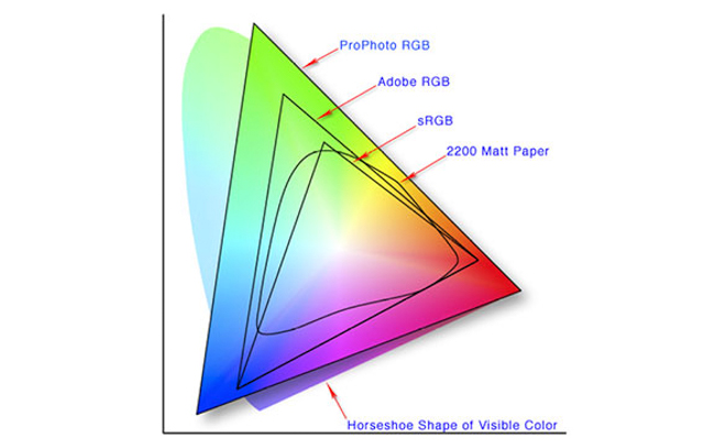
Anyway, if this whole idea of color space is a little confusing to you, that’s ok, you’re not alone. In very basic terms, it’s a spectrum/range of colors that can be represented in an image. As an oversimplified example, imagine a swatch of 100 colors (color space A), and then one of 1000 colors (color space B). If a picture were taken and loaded or printed using color space B, it would have so many more colors with which to render from, so it would look smoother and likely more accurate, whereas color space A would probably look blotchier.
[REWIND: A Breakdown Of Color Spaces | You Really Should Have A Grasp On This]
That is completely oversimplified especially when you consider that color spaces usually are in the millions of colors. If you’d like a more in-depth look at it, with suggestions when to use what and why, then have a quick read over this previous article of mine which should only take a few minutes. If you really want to get into the swing of this whole color thing, then you’re likely going to want to calibrate your monitor, and for that may I suggest this.


Get Connected!