We’re teaming up with Adorama to bring you a new series of photography tutorials called “Master Your Craft” to be featured on their YouTube Channel. Subscribe to see more of our videos on their channel throughout the next couple of months that will cover photography, lighting, posing, and editing education to help you hone your skills and master your craft.
In this video, we’ll discuss one simple thing to do before pressing your shutter to help you create more compelling photography.
We’ve all heard of common compositional techniques like the rule of thirds, perfect symmetry, leading lines and more. While each of these has their time and place, I’m here to share with you a simple trick to immediately begin creating more powerful imagery: it’s as simple as combining two or more compositional techniques in each photograph. Let me give you a few examples
 I aimed for perfect symmetry while featuring shapes within the scene. To do this, I placed the couple on the rock formation and cropped it so it looked like a triangle at the bottom center of the frame. I moved the camera to ensure the background mountain was the larger triangle that sort of framed the entire composition, while the height of the camera made sure the road acted like a diagonal leading directly into the subject. We’re also using a 4th compositional rule here which is to place our subjects in the highlights, or simply make them the brightest part of the image, which we did by adding flash.
 For this next image, I placed my bride in the brightest part of the composition. Second, I stood back and used a foreground element to add depth to the scene by shooting through that door which we’re also using to frame our subject, finally, I have the leading lines from the door and its frame leading into the subject.
In this image, I’ve placed my subjects again in the brightest part of the scene framed right over the road. Standing back, I shot through the trees to create a natural frame around the couple, while also allowing the leaves to act as negative space for the photograph. Finally, I added motion to the image by asking him to give her a twirl to add a sense of action and movement to the image.
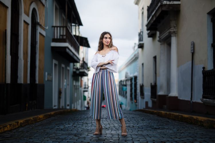
 In this image, we have 6 or 7 different compositional elements at play here. First, our subject is placed in the center third of the frame and we are incorporating a symmetrical composition with the buildings framing her on each side. In addition to framing our subject, the leading lines from the buildings pull us directly into our primary subject. We took a low position to place our models head and torso over the brightest area of the background sky, on top of that, we’ve positioned her in a place where the natural light in the scene is making her the brightest part of the frame, I then instructed her to take a wide positioned stance to give her a sense of strength over the frame. We also planned the wardrobe to match the colors and tone that we’d typically find in Downtown San Juan Puerto Rico, so all of our colors are harmonious. On top of that, we used Visual Flow Modern Pack Preset to further pull all of our tones into one cohesive set of warm pastel colors.
We hope you enjoyed this video and lesson on composition photography. Catch our next episode of Mastering Your Craft on Adorama’s YouTube channel next Friday!


